The history of Bitcoin cycles and four-year growth charts. We dissect the market, analyzing how the recurring patterns evolve
- Bitcoin is still cyclical, but the mechanism of the cycles itself is changing.
- Bitcoin cycles used to be predictable (4 years, tied to the halving), but now they are changing due to the arrival of large investors (ETFs, funds). The market is turning from speedboats (retail) into slow tankers (whales).
- Bitcoin works like a sponge: more money – price goes up. That is why the cycles are influenced by Global Liquidity (M2 and the Fed's interest rates).
- The institutionalization of the market makes moves less dramatic, longer, and more dependent on global liquidity and macro policy.
- Historically, Bitcoin spends only ~1.93% of its time in the peak zone (about 26 days per cycle).
- In the current cycle, Bitcoin's dominance has not declined, and the usual altseason is absent
- At the same time, money liquidity (M2) and the Fed's balance sheets have started to grow, and historically this leads to a rally. However, Bitcoin continues to decline.
-
Below, read our engaging and comprehensive exploration of BTC cycles.
Bitcoin doesnt like randomness - it prefers cycles.
You will learn what kinds of cycles exist, how to identify which cycle is currently in effect, and whether there is an optimal time to enter crypto. Expect lots of charts - fewer guesses. Throughout the article youll learn about all types of cyclicality.
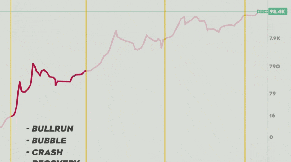
Every cycle consistently contains four phases:
- Bull rally – a sharp rise, the so-called bull market.
- Peak – a bubble inflates, when the price is overvalued.
- Bear Market – a steep decline (price correction).
- Bottom – market recovery or price bounce after a drop.
Now lets look at the types of cycles themselves.
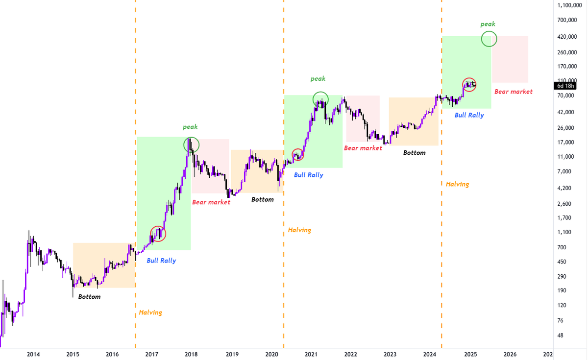
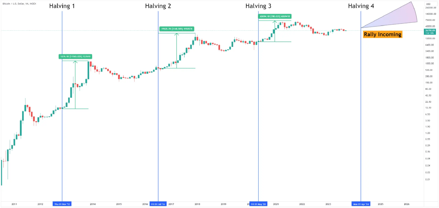
Supply-reduction cycle (halving)
It is commonly accepted that Bitcoins growth cycle follows roughly four-year periods, where the reduction of new coin issuance (the halving) often precedes significant price increases.
However, it would be naive to assume cycles depend solely on the halving - i.e., the number of coins mined. Moreover, cycles have shifted over time and are gradually losing some of their force.
Why have cycles shifted? The halvings influence on Bitcoin price is decreasing because of the dominance of institutional investors (large investment funds, sovereign reserves, ETFs), whose steady structural demand absorbs miners selling and disrupts the usual retail-driven dynamics of sharp rallies and crashes.
Heres a simple price-movement analogy. Institutional investors behave like tankers, while retail investors are like small high-speed boats, resulting in slower but larger cycles and reduced volatility.
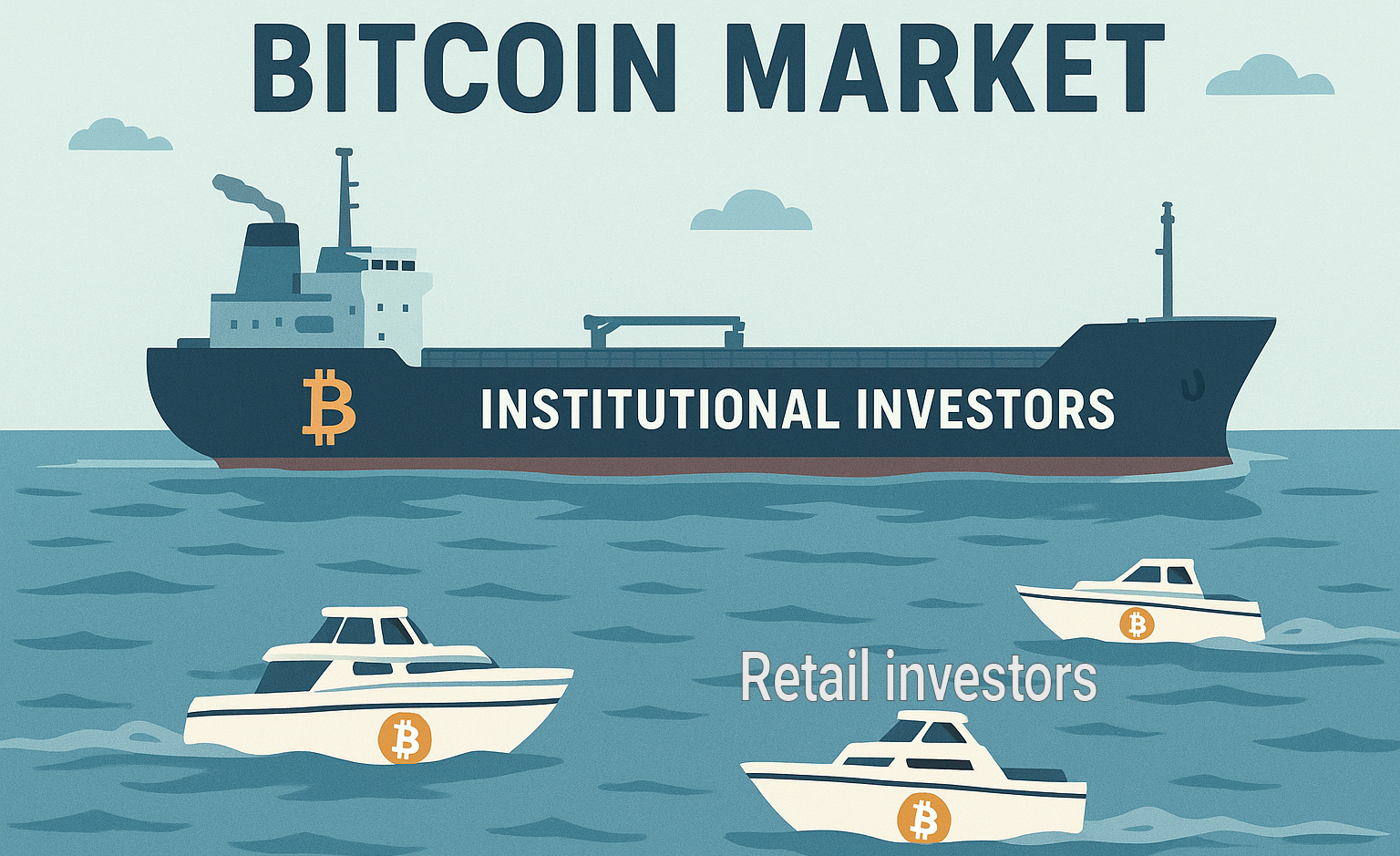
Previously the market was driven by small speedy boats; now its slow, fat tankers.
The halving cycle itself is not canceled and it still creates a baseline structural supply deficit for BTC. However, its effect has been transformed by more powerful external forces - for example, global money supply (M2).
Is the halving being masked by M2?
Analysis of global year-over-year money supply (M2) growth shows a clear correlation with bull markets in 2013, 2017 and 2021.
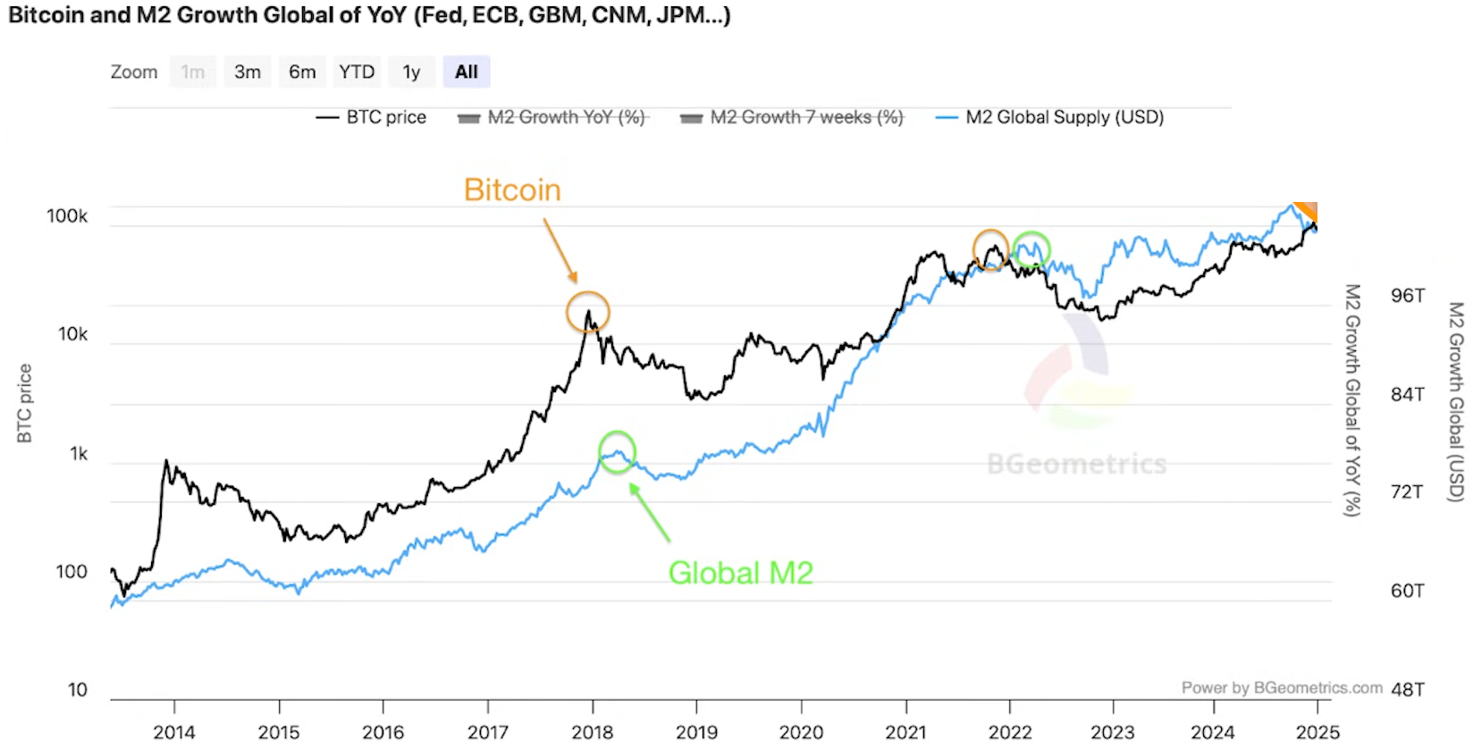
See for yourself - the M2 indicator is here.
The indicator shows that macroeconomic factors, not only internal Bitcoin events (like halving), are the primary drivers of these cycles.
M2 is the volume of money in circulation and depends on central bank rates. Low rates increase liquidity, and cheap money flows into risky assets, including Bitcoin.
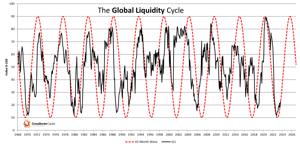
Liquidity is the cycles fuel
Bitcoin cycles directly depend on the availability of money and credit in the economy - i.e., global liquidity. This is because Bitcoin behaves like a sponge, absorbing excess liquidity.
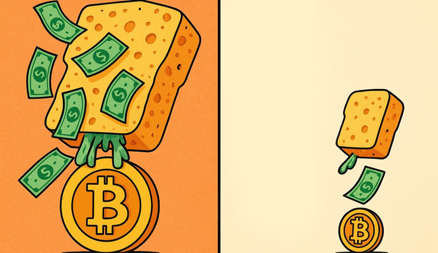
Simply put: when theres lots of money in the economy, Bitcoins sponge soaks up more of that liquidity.
The chart below shows three waves of liquidity inflows that correspond to the cycle:
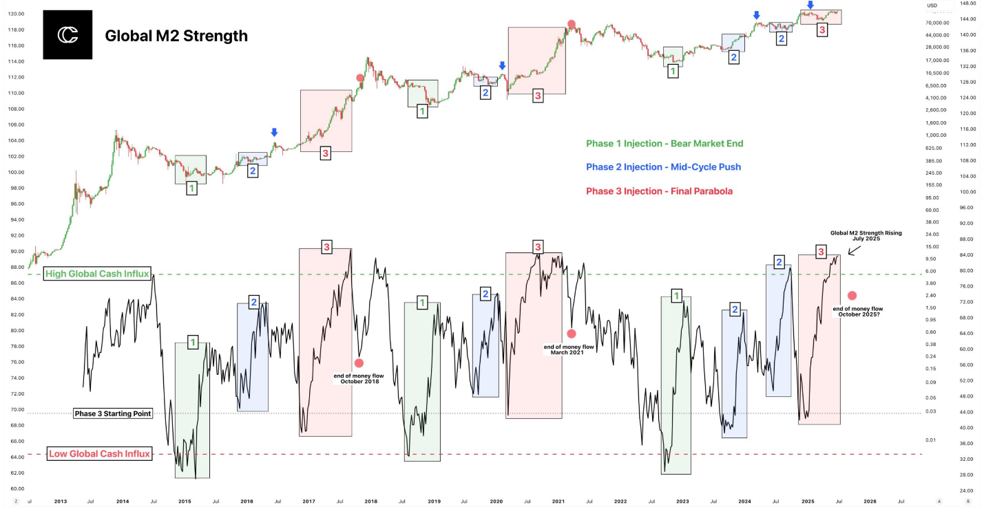
- Phase 1 – the end of the bear market. Liquidity begins to flow in, triggering price recovery.
- Phase 2 – the middle of the cycle. Money continues to flow, pushing the market higher.
- Phase 3 – the final parabolic move. A massive influx of money creates a bubble and a price surge before the peak.
Historical confirmation: the 2022 bear market was directly triggered by the Feds monetary tightening. The regulator raised rates and implemented quantitative tightening.
Liquidity left the market → all risky assets, including Bitcoin, fell. Heres the chart:
Since 1970, global liquidity has shown cyclical fluctuations, periodically expanding and contracting roughly every 5–6 years.
Time to summarize. Lets look at a table of factors that influence crypto growth and decline cycles.
|
Factor |
Impact |
Where to check |
|
Halving |
Reduces issuance of new BTC. Lowers the supply of newly minted coins. |
Countdown to the next halving |
|
Liquidity (M2, global) |
Cheap money from central banks stimulates demand for risky assets (BTC). |
Data on money-supply aggregates (M2) from FRED. |
|
Federal Reserve interest rates |
Low rates make BTC more attractive. High/rising rates have the opposite effect. |
Series of Fed rates. |
|
Institutional demand (ETFs) |
Large, steady purchases by funds create a structural supply deficit. |
Official statements and ETF listings at the SEC. |
|
Market psychology |
FOMO during rallies and panic during sell-offs amplify cyclicality. |
The Fear & Greed Index. |
|
Technical indicators |
Help identify overbought/oversold conditions and potential reversal points. |
MVRV Z and other on-chain indicators |
|
Macro events |
Crises, elections, regulatory decisions create volatility and affect sentiment. |
Having understood which factors shape these cycles, youll want to determine the current cycle.
Identifying the current cycle will help you decide optimal entry/exit points in the market.
How to identify the current cycle?
Yes, four-year cycles may not always work, but human behavior doesnt change - their psychological patterns of fear and greed remain.
Theres a simple behavioral pattern in the market that includes 4 phases and 4 investor emotions:
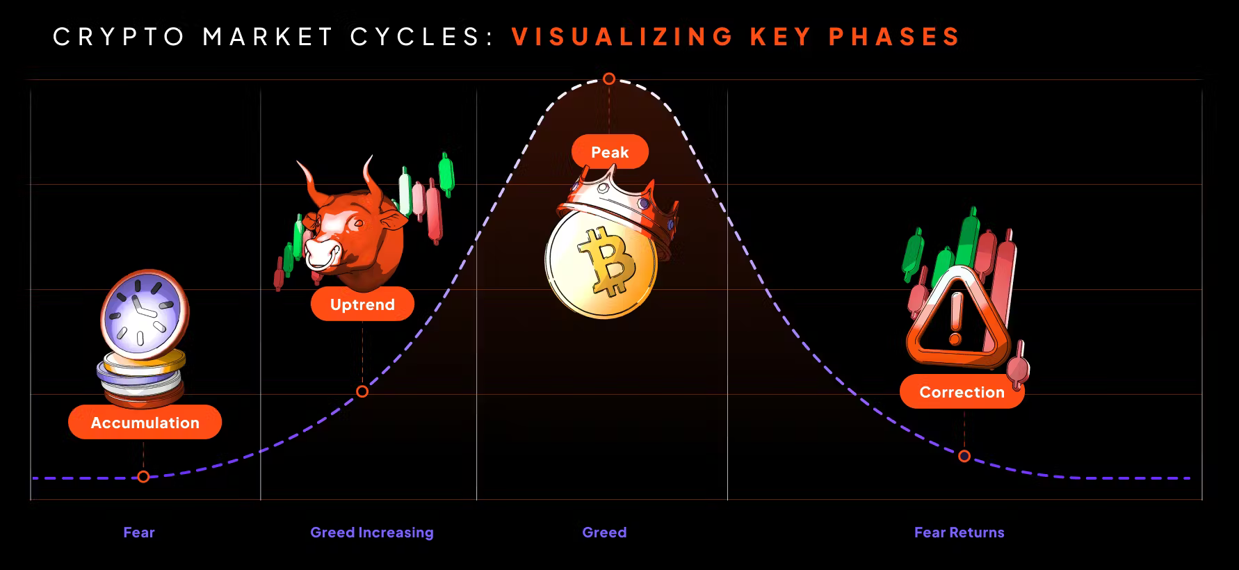
- Fear (accumulation) – price is low; people are afraid to sell at the bottom and positions are accumulated.
- Greed increasing (uptrend) – a strong trend begins with rapid growth and volatility. This is called a bull market.
- Greed (peak) – often resembles a bubble. Large players are already taking profits and the pace of growth slows.
- Fear returns (price correction) – a trend begins that brings the price back to a new accumulation level, closing the cycle. The bear market begins - a market of falling prices and fear.
It all looks simple. Just four phases, and it seems you could sell at the Peak and buy at the Fear bottom.
But thats the catch: the peak phase is characterized by euphoria, when people are blinded by gains and ignore risks, leading to unstable rallies and sharp corrections. The market storms - alternating sharp drops, then buybacks and new price peaks.
Lets look globally at the whole historical behavior of people and the patterns this chart shows.
Despite massive volatility, each subsequent cycle produces significant long-term growth in Bitcoins value. At the same time, crowd psychology (the fear and greed) repeats over and over.
Another important diagram of patterns is below. Each ring represents a tenfold price increase: 1 → 10 → 100 → 1 000 000.
Colors reflect short-term holder behavior - green means peaks, red means bottoms.
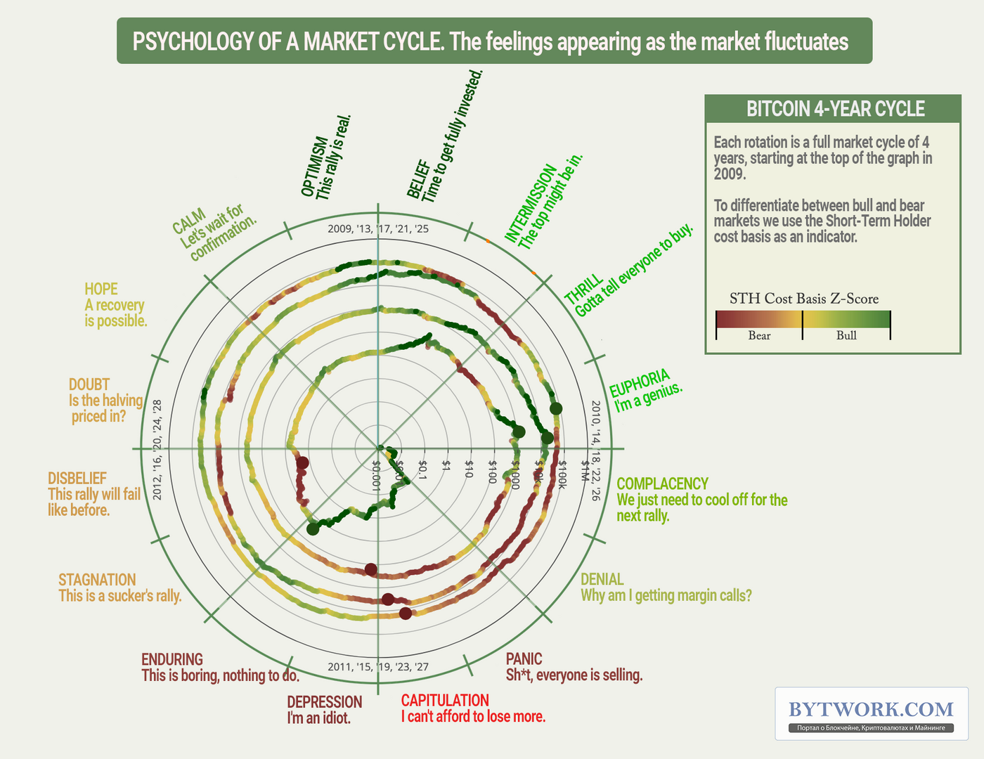
The diagram helps determine the cycle phase and estimate time until the next peak.
And while historical patterns tied to human psychology and market cycles still hold, thats not enough. Fundamental analysis and various technical indicators come to the rescue.
Well review them below, because when BTC enters peak or bubble territory, social indicators come to the forefront.
Social price indicators
When Bitcoin enters maximum euphoria, it shows up not in charts but in social activity. Thats when crypto moves from a niche topic into mainstream awareness.
Signs of a price peak:
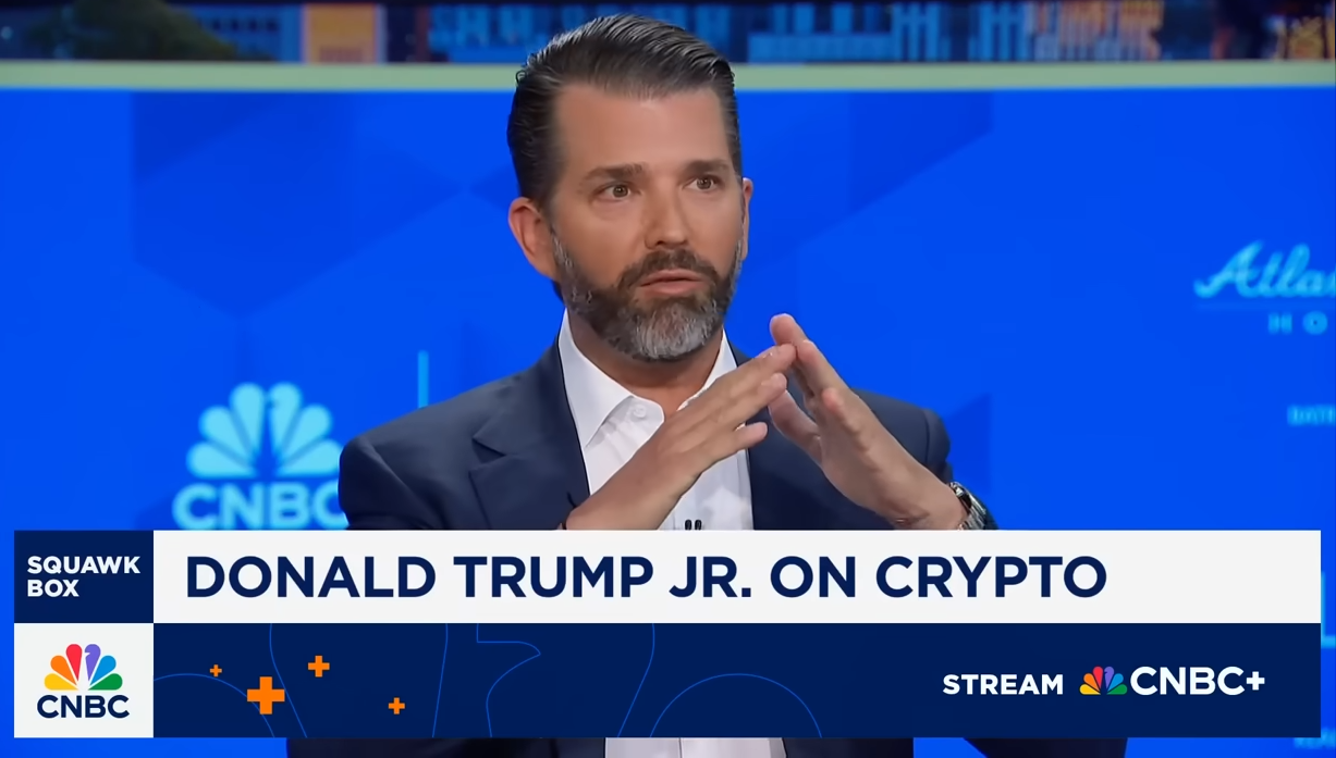
- When BTC starts being discussed on TV and other media.
- When crypto topics (e.g., NFTs) are covered on an evening show that normally focuses on other subjects.
- When your barber, neighbor, and taxi driver start giving financial advice about crypto.
- When your relatives and friends ask you what Bitcoin is.
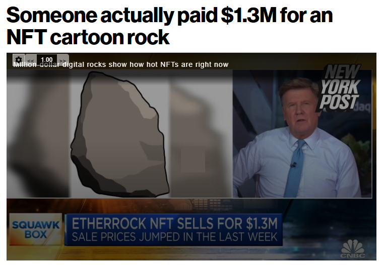
- Loud, sensational news appears about someone who paid $1.3M for a cartoon crypto rock.
- Major brands begin PR campaigns around BTC-based projects.
If several items on the list (especially 1, 3 and 4) occur together - thats a sign of mass euphoria and a high probability the market is near its peak.

In the photo, an evening show host raised the topic of crypto-NFTs.
The New York Post report about NFTs.
You dont need to be a chart expert to spot a peak, but how do you know if the market is in another phase? Technical indicators will help.
Fundamental analysis and technical indicators
Understanding basic and advanced indicators will give you a deep and systematic view of how the crypto market works.
Lets be honest: indicators arent a crystal ball. They are probabilistic signals about phases, not exact dates. Yet combined with social indicators, they help most accurately determine market movement.
Most serious analysts dont rely on a single indicator - they take a weighted view of 3–6 metrics (on-chain + a few technical tools: MA, RSI, etc.).
Prepare for a dive into the technical part of the article. We promise to keep the language simple, but some professional terminology is unavoidable.
In broad terms, technical indicators in crypto are attempts to represent market data as mathematical charts to spot signals and patterns.
There are hundreds of indicators, so well highlight only the main ones.
- Bitcoin RSI – shows overbought (>70) or oversold ( <30) conditions. Here is a complete guide to RSI.
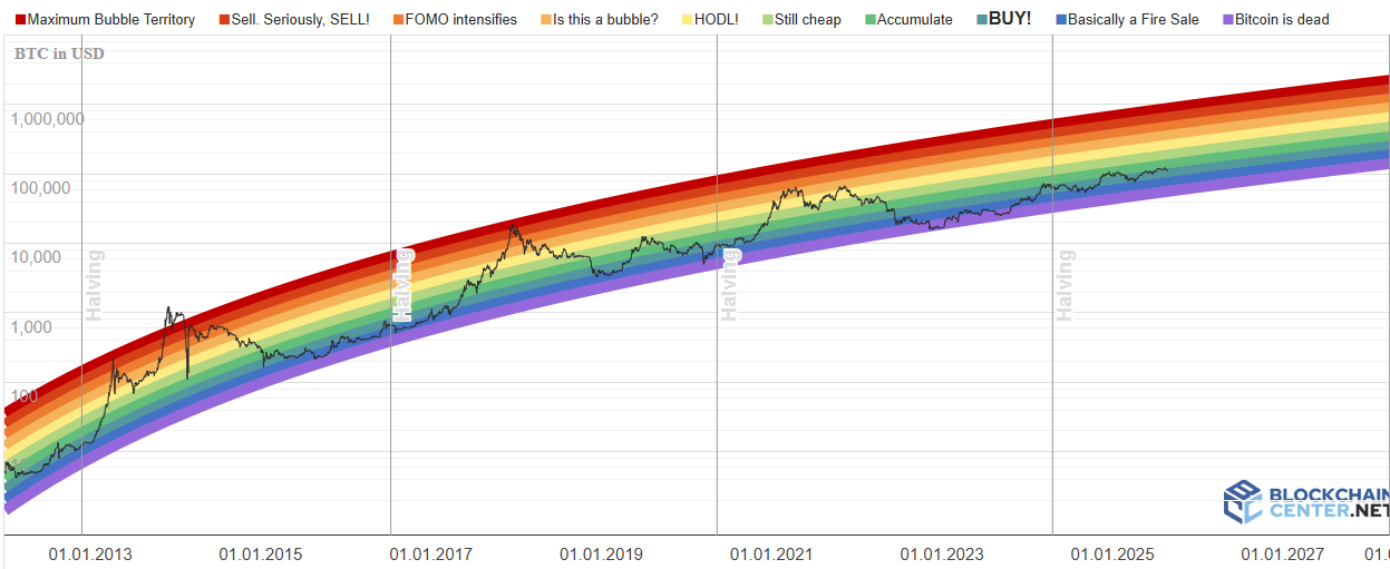
- Rainbow Chart – a visual rainbow chart where colors indicate actions. Dark blue/purple = very cheap/buy, green/yellow = hold/evaluate, orange/red = overvalued/sell.

- NUPL – shows how many holders are currently in profit or loss. If most are in profit, the risk of a correction is higher. If most are at a loss, it may signal a buying opportunity.
- Reserve Risk – gauges buying risk by comparing BTC price to how many coins are held long-term. More long-term holdings generally mean lower risk.
- MVRV – compares current price to the price at which coins were acquired. Shows how many investors are in profit.
- 2 Year MA – a midpoint for price. A strong move above it can signal a bubble; a fall back to it can indicate correction or capitulation.
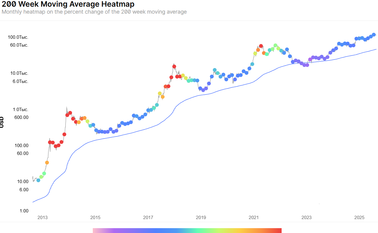
- 200 Week MA Heatmap – shows how hot or cold the current price is relative to the long-term trend. Bright red is often a sell zone.
From experience, its better to react to market movement than to try to predict it.
Key fundamental metrics for assessing Bitcoin also include the number of active users and transaction volume, rather than any single indicator.
The following indicators also help find movement patterns:
- Puell Multiple – shows how profitable mining is for miners. A high value means miners are incentivized to sell, putting selling pressure on price.
- Golden Ratio Indicator – shows price levels built on Fibonacci/golden ratio levels.
- Logarithmic Growth Curves – indicate whether price follows a historical model of slowing but steady growth. Exceeding the upper curve implies a bubble; falling to the lower curve implies strong undervaluation.
- RHODL Ratio – shows when newcomers (speculators) are actively buying BTC from experienced holders. A high value is a sign of euphoria and a market top.
- Illiquid Supply Change – indicates whether large players are accumulating coins (bullish) or moving them to sell (bearish).
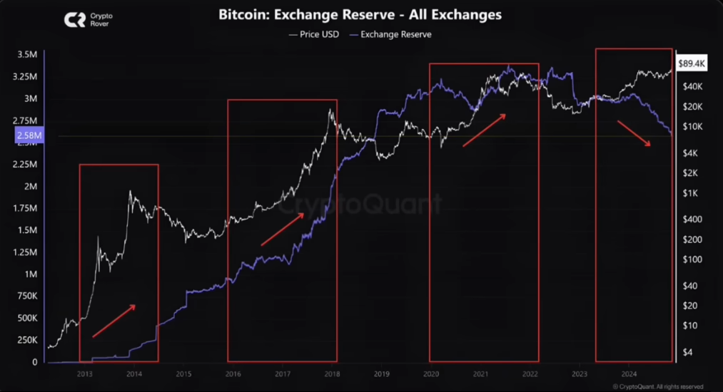
Also important are exchange inflows/outflows - inflows to exchanges often precede sell-offs, while outflows often signal accumulation phases.
Its important to understand that you have only 1.93% of the time in the cycle to catch the peak.
Its over - you missed it!
Price history shows that Bitcoin spends only about 1.93% of the time above a certain orange line - roughly ~26 days per cycle - when achieving maximum profit is most likely.
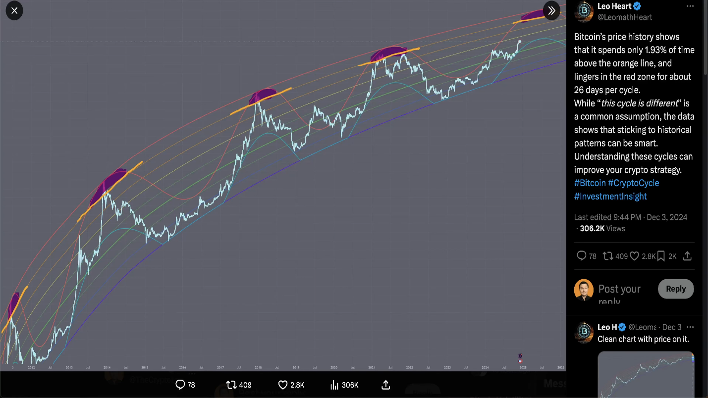
This is a narrow window and missing it can lead to significant financial losses.
It takes about 3 years, 10 months and 2 weeks from the previous cycle peak to return to this window.
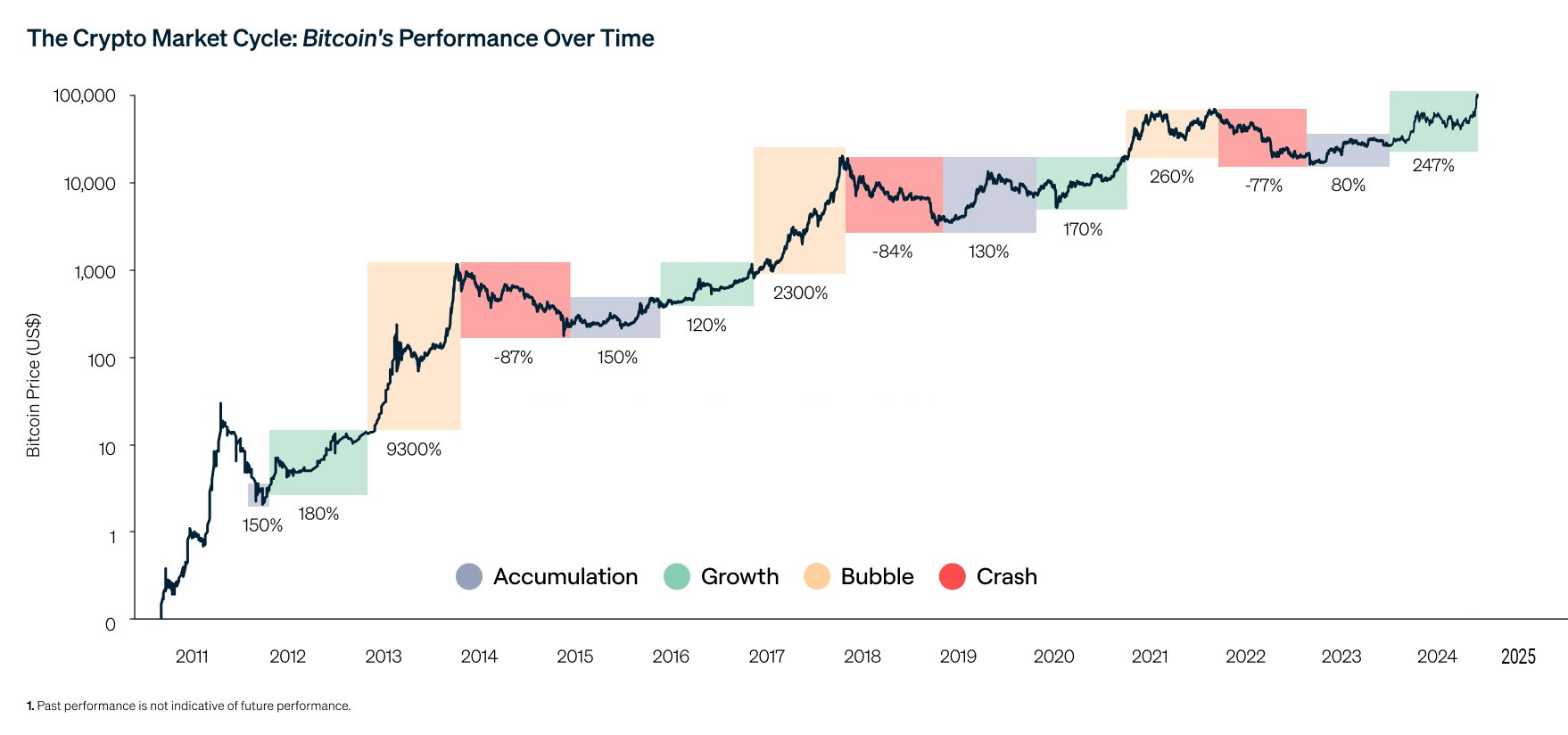
Below is annual BTC return (%) for each year starting from 2011 - i.e., how many percent the price rose or fell in a given calendar year.
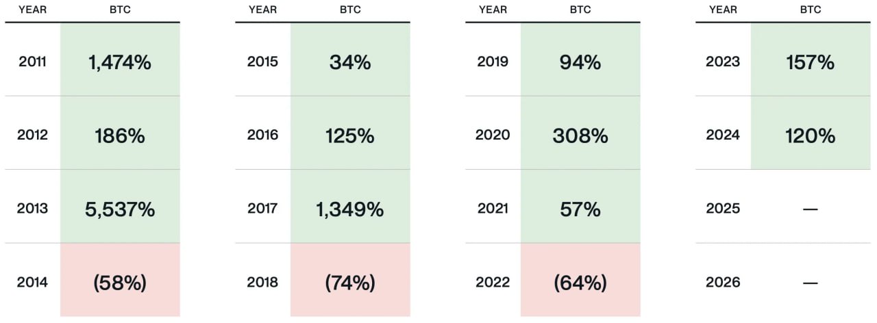
You can see a cycle: 3 years of growth - then 1 year of decline. There was also a drop in BTC dominance due to a shift into altcoins. This usually accompanies the end of a bull market.
Current BTC dominance does not confirm such an ending, however the probability of a sharp reversal always remains.
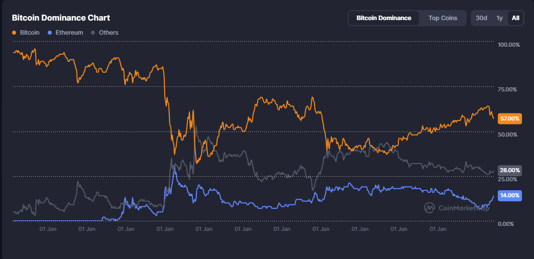
Watch the BTC dominance indicator here. Why historically did an altcoin phase follow Bitcoin?
Is the altcoin cycle dead?
Historically, after a Bitcoin peak there has been a tendency for altcoins to rally, usually lasting about 2–3 weeks. This creates an additional window to take profits, as investors rotate funds from Bitcoin into altcoins for a final leg up.
However, there are reasons to believe the altcoin cycle is broken. The Altcoin Season Index also shows interest mainly concentrated in BTC.
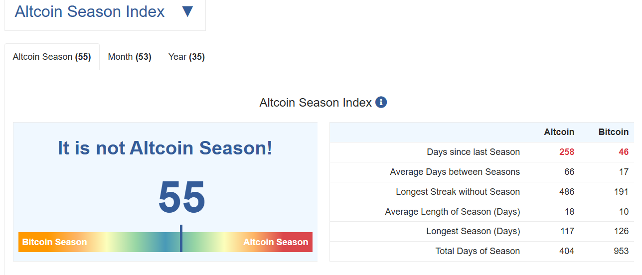
The reason is that speculative capital that used to flow into altcoins now finds exits in memecoins and in stocks of companies holding Bitcoin.
The traditional altcoin-season as we knew it may not repeat. The current cycle is characterized by unprecedented concentration of capital and interest in Bitcoin. Time will tell.
Other cycles
To fully understand Bitcoin cycle phenomena, learn about other regularities. The most popular is the Pi Cycle Top.
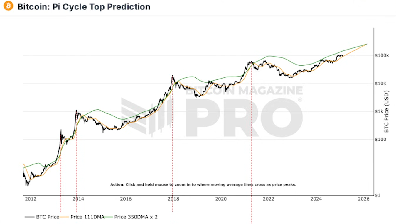
Pi Cycle Top
Pi Cycle Top Indicator is a historical peak indicator for BTC cycles. It has two averaged lines (~111 days and 350 days×2). If the short line crosses the long one from above, it is a strong peak signal and potential large correction.
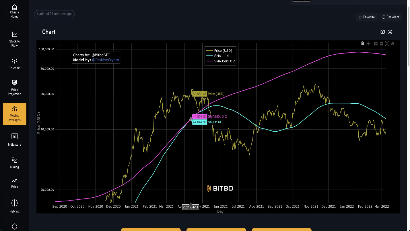
Many traders rely on the crossing of the Pi Cycle Top lines. However, the fact that those lines have not yet crossed and show no sign of quickly converging is interpreted by some as an indication that the current bull cycle is not yet exhausted.
Some argue that Pi Cycle Top has stopped working because institutional investors entered the market. Their actions changed demand structure, making it steadier and less emotional.
BTC Power Law Theory
Within this theory, a cycle is one full revolution around the power law price trend, including the phases of overheating, crash, and a return to the fair value line.
Read in the main article: BTC Power Law Theory: does it work and why does it promise a $1 million Bitcoin
Market capitalization
Reaching a $1–2 trillion market cap changed everything. Such a large market size means far bigger capital flows are now required to move the price.
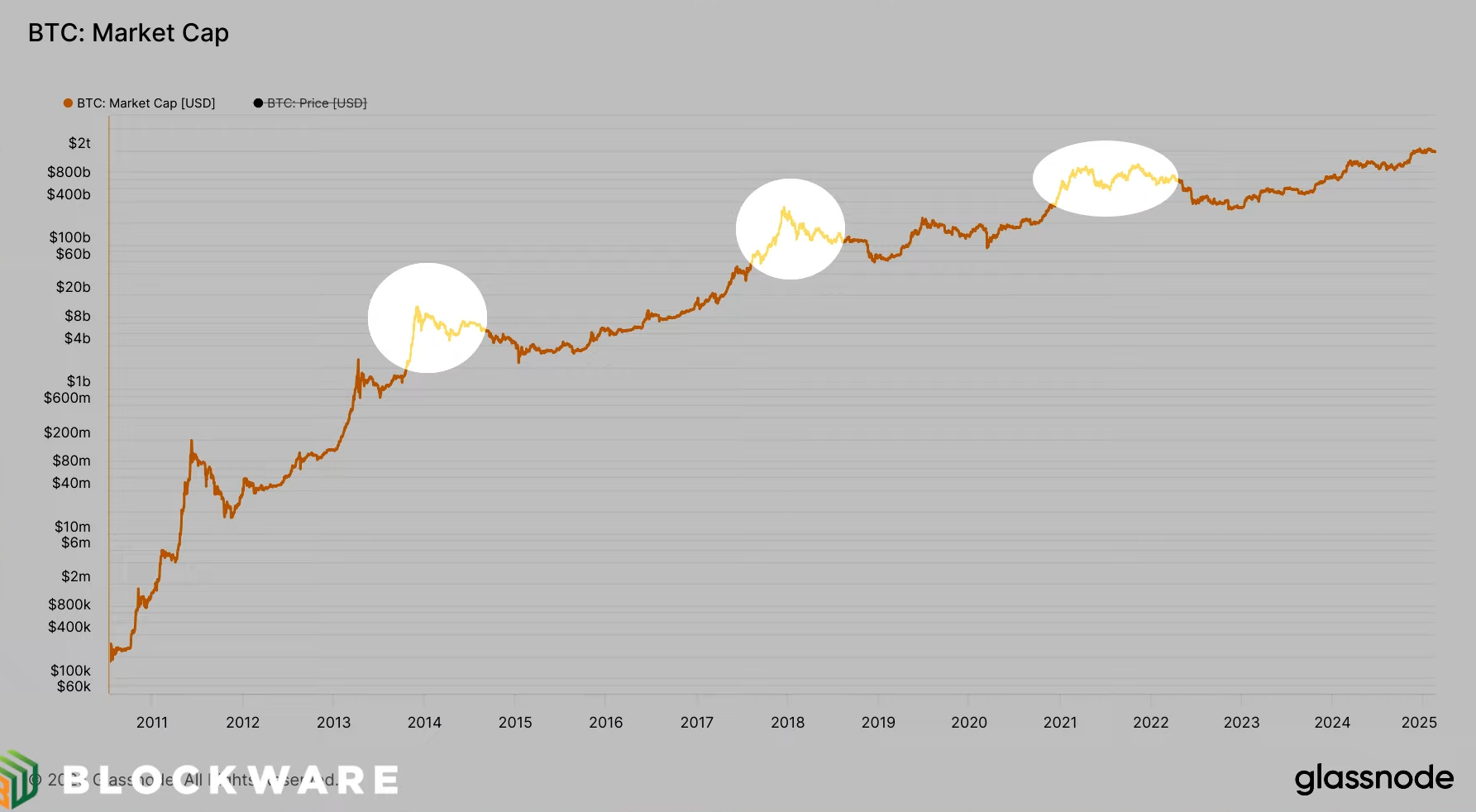
Retail investors can no longer move the market significantly. This has led to reduced volatility.
Energy gravity
Energy gravity is a concept explaining that the cost of Bitcoin mining acts like an attractive force, constraining its price and shaping market cycles.
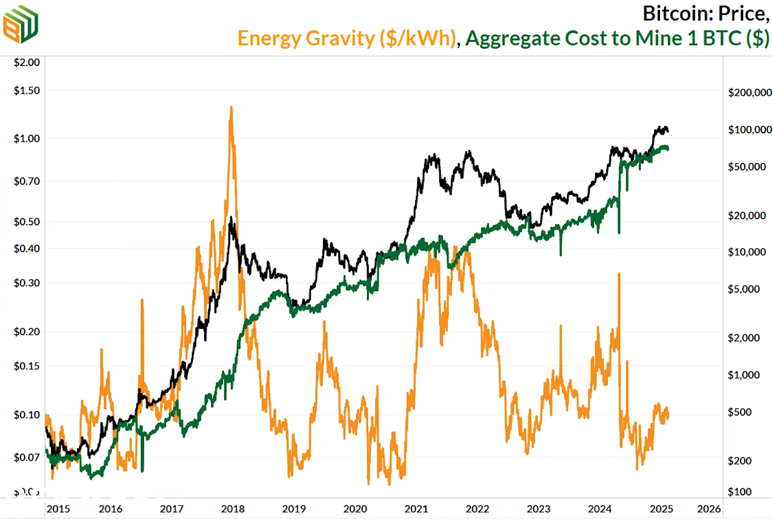
The chart shows that mining cost (orange line) soars during bull markets (2017, 2021). Why? Because high BTC prices draw massive amounts of new mining equipment, which sharply increases network difficulty. Mining one BTC becomes more expensive.
In this cycle, the mechanism on this chart has weakened or no longer works in the same way.
The reason is the emergence of a new, powerful source of demand - institutional investors (ETFs). Their purchases absorb miners sales and create a consistent supporting pressure from below. This prevents price from falling back to mining cost as it did before. This fundamentally changes cycle dynamics.
The final cycle
Since new bitcoins are created only as miner rewards, when that reward halves, the issuance rate immediately halves as well. This shows up as a step on the chart.
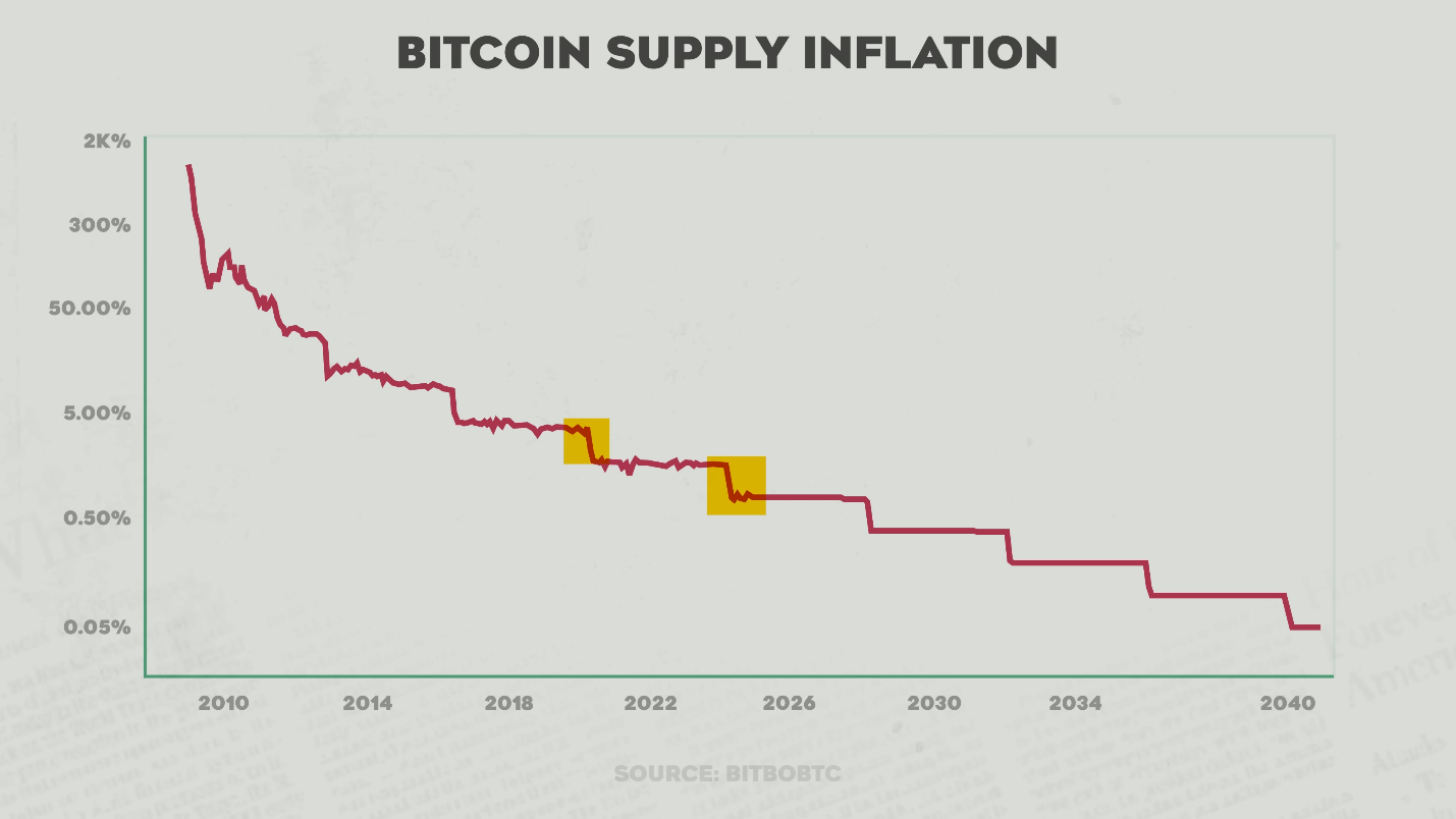
Within the crypto community theres a theory that after several halvings Bitcoins inflation will be so low that it will become an absolutely scarce asset.
BTC issuance will be lower than that of gold and other scarce resources. At that point, its value as digital gold may be finally recognized by the global economy, and the sharp cyclical price swings weve seen in the past could disappear.
The deflationary effect is amplified by strong institutional demand, which is the main difference from past cycles.
Lets keep monitoring cycles together - add our site to your bookmarks!
And now to the conclusions.
Conclusions
Weve risen and fallen. Price soared, everyone went crazy with greed, and then it crashed 70–80%. We sat on forums and kept discovering something new about Bitcoin. The market used to be driven by ordinary people - everything followed a predictable 4-year scenario (from halving to halving).
But the big uncles with capital replaced ordinary people. The market changed. It turned from a speculative toy into a serious institutional asset bought by whales. This means the wild rollercoaster rides are likely behind us. The cycle became more boring, but also more stable. Bitcoin has matured.
To summarize:
- The traditional four-year cycle may be disrupted, leading to a longer bull market synchronized with stock-market dynamics.
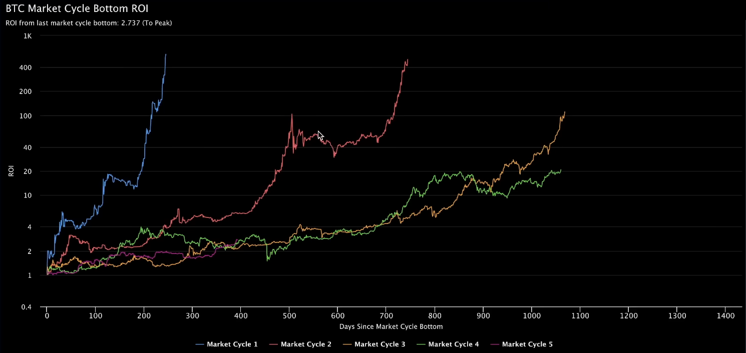
- Bitcoin shows a trend of declining returns across market cycles.
- The price peak lasts about 26 days.
- Seasonally, Q4 is the strongest quarter for BTC.
- Historical Bitcoin cycles show that volatility and potential losses decrease with each subsequent cycle.
- A bull cycle may not be as explosive as before due to market maturity and new financial instruments, which can lead to a more prolonged rise.
- Market trend (bearish/bullish) is also worth considering.
And remember that the only thing we can control is our risk!
Disclaimer. all information provided in this article should not be construed as financial advice. The article was created for educational purposes. Never invest more than you can afford to lose, and consult only your personal financial advisor for advice.

Now reading


In DePin, people create networks themselves, share traffic or capacity, and receive rewards in tokens from these projects.


The Ellipal firmware update enhances security (fixes vulnerabilities), adds support for new cryptocurrencies and tokens, and optimizes the interface and operational stability.


