BTC Liquidation Heatmaps: A Guide to Seeing the Market with X-Ray Vision
- Liquidation heatmaps allow you to "see through the market," understanding exactly where 90% of retail traders will incur losses.
- Bright zones on the map act as a "magnet" for price, as large players aim to steer the market into these areas to execute their orders.
- There are 4 practical strategies for leveraging these maps.
- However, using the map in isolation from other signals is not enough.
Read below to gain the best understanding of liquidity maps.

You will learn how to gain "X-ray vision" of the market, allowing you to see the hidden levels where massive volumes of stop-losses and forced liquidation orders are concentrated.
Liquidation heatmaps are popular tools in the crypto space because they help identify significant levels for trade entries, stop-loss placement, and take-profit targets.
Recall that liquidation in crypto is the forced closure of your position because the price has moved against you, and your collateral is no longer sufficient to cover the losses on the exchange-provided loan (leverage).
To begin, let's break down what liquidation heatmaps are.
What are Liquidation Heatmaps?
A liquidation map is a graphical representation of the liquidation levels for traders' currently open positions. For example, if you open a long position on Bitcoin at $87,000 with a liquidation level at $84,000, your position will be reflected on this map.
If many traders share the same liquidation level, it will be marked with a brighter color. The brighter the color, the higher the concentration of liquidations at that specific price level.

These maps are important because as the Bitcoin price moves and traders open long and short positions, these levels represent liquidity in the order book. Often, such liquidity acts as a magnet: a large volume of liquidity below the current price can attract the price towards it!
Heatmaps color these zones, making it easy to find both potential danger levels and possible directions for price movement.
As traders, we use these maps as X-ray vision to find hidden support and resistance levels, determine profit-taking targets, and place stop-losses outside zones of mass liquidation.
Where to view Liquidation Maps?
There are several services:
- CoinGlass – the most popular and free. Supports many currencies (e.g., Bitcoin, Ethereum, SOL, XRP, Doge)
- Hyblock Capital – a paid alternative to CoinGlass. But it has several advantages: it specializes in "predictive" liquidations, allows filtering data by leverage level (from L1 to L5).
- Trading Different – paid. Offers unique tools such as "liquidation pools," a trend indicator, and algorithms for swing trading.
- Spread Fighter – paid. Provides high-speed interface performance and displays exact liquidation amounts at specific price levels. Includes additional indicators like "Stop Killer," which shows large liquidations in real-time.
Historically, data from Hyblock Capital and CoinGlass differ slightly. 
However, beginners are recommended to start with CoinGlass since it's free. As for Hyblock Capital, its package costs $69 per month or $100 per year. In the future, you can invest in a trial month on Hyblock to check if there's a significant difference in accuracy.
How do Liquidation Maps work?
The indicator collects data from major exchanges (Binance, Bybit, etc.) and calculates liquidation levels based on popular leverage levels (25x, 50x, 100x). These zones are called liquidation pools. Pools below the current price show long (buyer) liquidation levels, while pools above the price show short (seller) liquidation levels.

When the price reaches a short liquidation level, the exchange forcibly buys back the asset to close their positions. These mass purchases push the price even higher, triggering the liquidation of the next groups of traders at higher levels.
The result is an "unstoppable force" that drives the price up until the fuel (short liquidity) runs out.
High-risk traders (levels L1–L3) are liquidated first with the slightest price movement, creating momentum or a cascade.
The analogy is simple - a liquidation cascade is like falling dominoes. The first falling domino (trader with 100x leverage) pushes the next one (50x leverage), and the further this process rolls, the more energy it gains. A heatmap is your way to see where the densest rows of these dominoes stand, so you're not in their path when the fall begins.
As always, let's move from theory to practice.
How to Read a Liquidation Map?
To start using the CoinGlass liquidation heatmap, open it. You will see a volume scale on the left and price ranges on the right.

Bright areas, especially yellow ones – indicate the maximum concentration of potential liquidations according to leverage data.
- Horizontal stripes - price levels with clusters of liquidation orders. These cause strong movements when the price passes through them.
- Volume scale (left) - the approximate dollar value of liquidations at each level. It helps assess risk at different price points.
- Price scale (right) - price levels with liquidation clusters. Provides visual targets for price reactions or bounces.
- Candlestick chart (center) - real-time price movement. It shows intersections with high-liquidity zones.
- Time (bottom) - aligns liquidation interest with market timing. Helps anticipate reactions during specific sessions or timeframes.
Let's consider a liquidation example.

Liquidations will begin as the price approaches key levels:
If the price moves UP (shorts are liquidated):
- 90k $ and 91,665 $ - mass liquidations of short positions will begin here.
- 91,665 $ - the upper boundary of the screenshot, where order accumulation is maximum (bright yellow zone).
If the price moves DOWN (longs are liquidated):
- 84,000 $ and 83,339 $ - long positions will start being liquidated here.
- 83,339 $ - the lower boundary, the brightest liquidation zone in the screenshot.
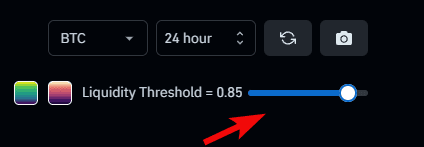
At the top, there is a slider Liquidity Threshold = 0.85 - this is a threshold value that filters out small positions. For example, it only shows clusters where the volume exceeds 85% of the average - meaning significant levels with large positions.
You can also configure timeframes and select a different cryptocurrency.
Three liquidation models are also available here.
What map Models are there?
CoinGlass offers you a choice between three specific data display models:

Model 1
This model focuses on high precision of levels. It highlights the largest liquidations at specific price points. This is particularly useful for identifying liquidations at historical highs or lows.
Model 2
Displays broader areas (zones) where significant liquidation clusters occur. It's best to use Model 2 specifically for analyzing key zones where the majority of traders are liquidated.
Model 3
A comprehensive set of parameters, sometimes including additional data or alternative calculation methods, to show a deeper zone of liquidation and liquidity around important price levels.
There is also a graphical view of liquidations.
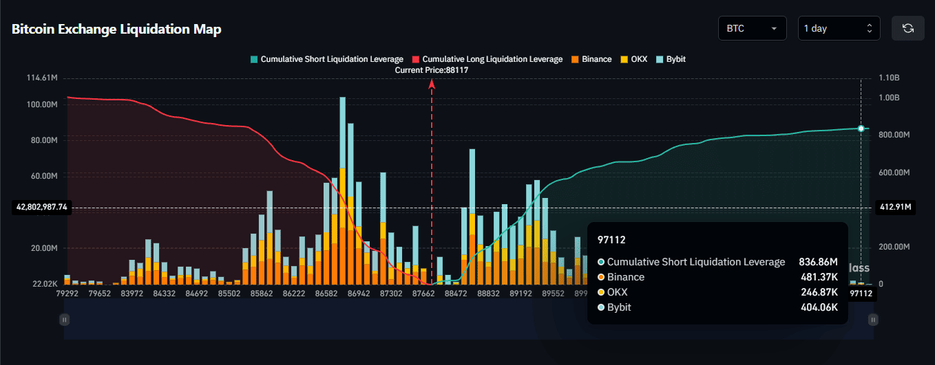
How to read the graph:
- If the price moves UP - shorts are liquidated. On the graph, these are green zones with high concentration of
Cumulative Short Liquidation. - If the price moves DOWN - longs are liquidated. On the graph, these are red zones with high concentration of
Cumulative Long Liquidation.
The dots on the graph (Binance, OKX, Bybit) represent specific exchanges where positions are concentrated. And while liquidation maps for most exchanges on CoinGlass are built on algorithmic assumptions, the data for the Hyperliquid exchange is considered more transparent and accurate.
Now the question arises: what to do with this knowledge?
How to Use Heatmaps in trading
Use liquidation heatmaps in your trading in several ways.

Find entry points, more accurately determine stop-losses and take-profits. Let's look in more detail.
Risk Management Strategy
First, liquidation maps can be used for risk management: it is extremely important not to place your stop-loss and not to have your own liquidation level within these highlighted zones, as the probability of Bitcoin touching one of these levels increases.
Strategy for Finding Entry and Exit Points
Second, apply them to find entry and exit points. This is effective because, for example, if Bitcoin is trading at $88,000 but there is a significant liquidation cluster at $87,000, there is a high probability that the price will move down towards that level.

This can be used as an exit point from a short position or as an entry point into a long one. Similarly, if you are already in a long and see a large accumulation of liquidations above the current price, set your take-profit near this liquidity level, expecting the price may rise to take that liquidity.
"Trading from Pool to Pool" strategy
This strategy is built on the understanding that the market is often in a "range" state, where price behaves like a game of ping-pong.
First, the price reaches one large liquidity pool (e.g., at the bottom), "sweeps" it (liquidates positions), and then rushes to the next hot level on the opposite side (at the top). These liquidity pools (clusters of stop-losses and liquidation levels) act like magnets on the price. Traders using this approach bet that the market will inevitably reach these zones.

The trading from pool to pool strategy allows a trader to "see through the market," understanding exactly where 90% of retail players will incur losses, and to take a position alongside market makers who use this liquidity to execute their orders.
The historical example shows how the price, having reached a clear liquidation cluster (resistance level), bounced off it, and after the breakout, rushed to the next liquidity pool.

Then a large yellow cluster formed just above ~111k - this is a major sales level (resistance), where the price met resistance and rolled back.
Combine with other tools
To use this tool effectively, combine it with other metrics such as Funding Rates. Funding is not a price forecast; it's an indicator of sentiment and leverage levels.

- Positive values (above zero) - the market is overbought (many longs).
- Negative values (below zero) - the market is oversold (many shorts).
For example, if you see negative funding rates in the market along with a large liquidation cluster above the current price, this gives you two confirmations of a likely price increase.
Negative funding creates upward pressure, and the liquidity magnet above усиливает this bullish tendency. This makes liquidation heatmaps an excellent indicator for short-term trading!
But is everything so perfect? Of course not! The market doesn't create money; it redistributes it. And a heatmap is not the truth, but an assumption. It can show where clouds are gathering (liquidity), but it does not guarantee that the rain (price movement) will fall exactly there and at the exact time. A cloud may dissipate or rain a couple of kilometers from the predicted spot.
What are the disadvantages and risks of liquidation maps??
A heatmap is only an "X-ray" of the market, not its forecast!
| Disadvantage | Description |
| Predictive Nature | Data is based on calculation models, not actual facts. Errors or overestimations are possible. |
| Data Discrepancies | Different platforms (e.g., CoinGlass and Hyblock Capital) may show inconsistent information for the same asset. |
| No Price Reach Guarantee | Price does not always reach liquidation zones (magnets); it may reverse earlier or not absorb the entire pool. |
| Tool, Not a Strategy | Heatmaps serve as an auxiliary indicator but do not replace a full-fledged trading system. |
| High Cost | Professional versions of services (e.g., Hyblock Capital) can cost up to $2000 per year. |
| Technical Drawbacks | Some platforms are slow, have API and chart loading delays, or require constant data refreshing. |
Moreover, data is often limited to top-tier exchanges only, which doesn't provide a complete picture of the entire market.
In the end, using only a heatmap without an overall strategy is like trying to fly a plane by looking only at the fuel gauge. That's why consider our guides to always stay ahead of the market.
| Guide | Usefulness for Traders |
| Bitcoin Cycles (4-Year) | Analysis of long-term market patterns. Bitcoin moves in predictable cycles. This allows for thorough market analysis and avoids randomness. |
| Pi Cycle Top Indicator | A significant indicator for determining Bitcoin's price peak with shocking historical accuracy. Helps catch market tops. |
| RSI Indicator (Relative Strength Index) | A tool for assessing trend strength and identifying overbought/oversold moments. Helps choose the optimal time to buy or sell an asset. |
| Crypto Copy Trading | A strategy for automatically copying trades of successful traders on exchanges (e.g., BingX). Allows earning by repeating the actions of experienced market participants. |
It's time for conclusions.
Conclusions
A liquidation heatmap is not just a visual tool, but a graphical representation of the market's "hidden" liquidity, which serves as fuel for price movement. Reading heatmaps involves observing the color gradient. Purple indicates fewer liquidations, green indicates more, and bright yellow signals their maximum concentration.
There are 3 ways to optimize trading using this tool:
- Instead of entering at the top of a range, the trader waits for the price to sweep the liquidation pool and enters on the reversal.
- Bright liquidation zones are ideal targets for taking profit, as the price is highly likely to reach them and may stall there.
- Traders place their stop-losses outside the bright yellow liquidity zones to avoid being caught in the market makers' hunt for liquidity.
Large players (institutions and "whales") often aim to steer the price into these areas to obtain the necessary liquidity for executing their grand plans at favorable prices.
However, it's not uncommon for the price to stop a few ticks away from the largest liquidity cluster and reverse without ever touching it. This happens because the current volume of market orders wasn't enough to "push" the price into the zone.
Let's agree that the price of BTC changes not because of the presence of pretty zones on a heatmap, but because someone is opening or closing positions, executing market orders. A heatmap is merely a visualization of where these orders might appear in large volume.
Disclaimer: All information provided in this article should not be taken as financial advice! The article was created for educational purposes. Never invest more than you can afford to lose, and seek advice only from your personal financial advisor.

Now reading


In DePin, people create networks themselves, share traffic or capacity, and receive rewards in tokens from these projects.


The Ellipal firmware update enhances security (fixes vulnerabilities), adds support for new cryptocurrencies and tokens, and optimizes the interface and operational stability.


