CoinGlass: A complete review of all trading tools
What is CoinGlass?
The CoinGlass platform is a free collection of all trading data, allowing you to assess the crypto market holistically. It's not just a 5-minute chart of a single trading pair, but a comprehensive view of the market, including all inflows, liquidations, and sentiment trends.
Here you immediately see Bitcoin dominance, the dollar index, gold futures, Bitcoin exchange balance, and the Fear & Greed Index.

Open interest, liquidation volume, altseason index, RSI index, Longs/Shorts, etc. are also visible. It's convenient that everything is on one screen. Moreover, CoinGlass allows you to display all the necessary data directly on the price chart. Below we will see how to do this. First, let's look at the main tools.
|
Tool |
Practical Value |
| Liquidation Maps | Visualize forced closure levels, acting as a magnet for price. |
| Real-time Liquidations | Show amounts and directions of forced closures to track liquidation cascades. |
| Whale Orders | Tracks large limit orders, identifying levels where major players are preparing a reversal. |
| Order Book | Shows aggregated limit order data for analyzing supply and demand imbalance. |
You will also find tools for assessing the fundamental strength of a trend, capital flows, and market sentiment useful.
|
Tool |
Value |
| Open Interest | Shows the total amount of open positions, helping to confirm trend strength or identify its weakness. |
| CVD | Defines the difference between buys and sells to identify divergences and trend exhaustion. |
| Funding Rate | Shows the fee between traders, helping to assess market skew and arbitrage opportunities. |
| Long/Short | Reflects the ratio of long and short positions. You see retail trader sentiment. |
| Exchange Rankings | Displays fund movements and exchange balances to assess their reliability. |
If you want to build trading hypotheses, technical analysis, and long-term planning, consider these possibilities in the table below.
|
Tool |
Value |
| Options Analysis | Provides options data, including Gamma Exposure to determine key price ranges. |
| RSI Heat Map | Allows you to quickly find assets in overbought or oversold zones. |
| Supercharts | Ability to add all metrics to the trading chart. |
| BTC Daily Returns | Shows seasonal patterns and Bitcoin return statistics by days/months. |
| Rainbow Chart | Determines long-term market phases of Bitcoin to identify buying and selling zones. |
We recommend keeping the English language because the settings will be configured in English. This is because indicator names are easier to search for in English. You can change the language after setup. First, let's look at the most important tools.
Liquidation Maps
What is liquidation? It's the forced sale of losing positions by the exchange to prevent a trader's balance from going negative. You can more accurately identify key levels, avoid placing stop-losses in dangerous zones, and anticipate spikes in volatility.
Example
The top shows the nearest liquidation levels for ETH, BTC, and other assets. Below - distribution by exchanges.

When mostly longs are liquidated, it means the price has dropped, and many traders betting on growth didn't have enough funds to hold their positions. The 24-hour amounts show the overall scale. Long liquidations of $685M indicate strong selling pressure and losses for bulls. The lower part displays real-time liquidations.
Liquidations are like dominoes - when one position (especially with high leverage) is liquidated, it pushes the price further, causing a chain reaction of liquidations for other traders.
You can more accurately determine key levels, avoid setting stop-losses in zones of mass liquidation, and predict moments of volatility spikes. But there are also liquidation heat maps.
Liquidation Heat Map
Liquidation Heat Maps - a visual chart showing price levels where forced position closures may occur due to insufficient collateral (margin).
Large clusters of liquidations (bright yellow zones) attract price as "whales" use them to execute their large orders.

Read the main article: how to see the market with X-ray vision using liquidation maps.
Remember, most exchanges (except Hyperliquid) do not transmit real liquidation points of their users, so the service builds these maps using its own algorithms, which can be wrong!
Funding
Funding (funding rate) is a mechanism that keeps the futures price as close as possible to the real spot market price. Simply put, it's a fee paid by some traders to others every 8 hours to prevent the futures price from deviating too much from the spot price. Positive funding pushes the market down, negative funding pushes it up.
- Positive rate (e.g.,
+0.6680%) - long positions (buy) pay short positions (sell). - Negative rate (e.g.,
-3.8504%) - short positions (sell) pay long positions (buy).

The maximum limit is usually around 0.0375, and debits occur every 8 hours.
Scrolling down, you'll see exact numbers for BTC, ETH and SOL. For example, holding a long on SOL on WhiteBIT, you receive 0.01% every 8 hours. Holding a short - you pay. This helps choose an exchange: where to pay less, and where to earn from funding.

Usage Example
These rates are a ready-made tool for earning. The strategy is simple - open a position opposite to the majority and receive regular payments. This is called carry trade. For this strategy, it is recommended to choose coins that "don't fly too much" to minimize the risks of sharp price gaps. In the end, your income is the funding payments.
Open Interest (OI) Analysis
The Open Interest (OI) tab shows new money inflows into a coin. For example, if open interest decreases, money is leaving, and a correction occurs.
In the example below, 1st place is CME - an exchange for hedge funds and ETFs. If its OI is growing, it means institutions are actively entering the game. Their actions set the trend. Growth in OI on Bybit and OKX indicates retail trader activity. By comparing dynamics, you immediately see who is leading the market.
Example: we see that across different exchanges, OI increased by 6% in 24 hours - the market is clearly heating up.

A high OI/24h_Vol indicator (like CME's) is a red flag. It signals an overheated market where any sharp movement will cause a flurry of liquidations and volatility.
The most valuable here is the change in OI together with the price, i.e., their interrelation.
How to read open interest correctly?
- Bullish trend - price rises + volumes and
OIalso rise (new buyers are entering the market). - Bearish trend (weakening) - price rises, but volume and
OIfall (buyers are losing interest, the movement is running out of steam). - Strengthening sales - price falls, and volume and
OIrise (bears are actively adding positions). - Precursor to an upward reversal - price falls, but volume and
OIdecrease (sellers are closing positions, a bullish signal of selling exhaustion).
There are cases when open interest does not grow, but a pump occurs - this is a fake pump, manipulation, on which you can also make good money. This indicator is key because coins grow when money is poured into them.
Supercharts and Custom Indicators
Supercharts combine various market data (open interest, liquidations, volume delta, and funding rates) on one screen. To use supercharts and add custom indicators you need to register. Registration is needed to save all settings. Without it, they will reset, and you will waste a lot of time.
After registration, open the chart and you will see many indicators on it.

But we recommend removing the unnecessary ones, leaving only volume and price, and then adding the needed ones. To remove indicators, hover the mouse over the name – a Remove button will appear. And you can select the exchange and pair at the top.
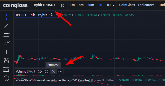
Now you can add the most important indicators.
Aggregated Open Interest
The first indicator is Aggregated open interest. Select it, and open interest appears on the chart, showing new money inflows into the coin.

This indicator is key because coins grow when money is poured into them – that's logical.
Aggregated Futures Cumulative Volume Delta
Next, we add Aggregated Futures Cumulative Volume Delta (CVD), necessarily in English to avoid confusion. We need futures, which show who prevails in the market: buyers or sellers.
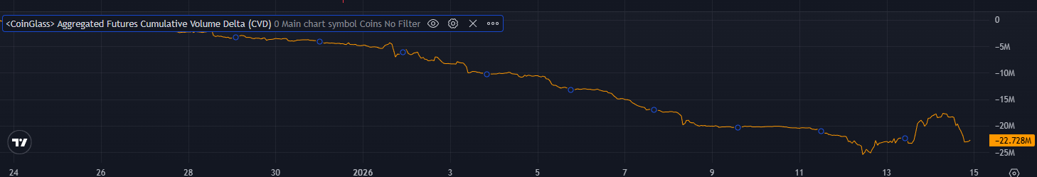
If CVD rises, buyers are pushing, and the price may rise; if it falls, the price often declines.
Aggregated Liquidations
Aggregated liquidations sum data from all exchanges, and this is more reliable. Add Aggregated Liquidations. Liquidations appear on the chart: red - short, green - long.
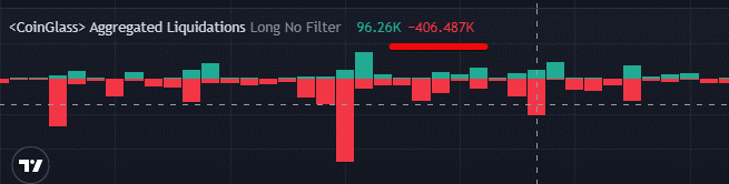
Hovering the cursor, you can see the liquidation amount, as well as the values of CVD and open interest at that moment.
Net Indicators
Then add Net Delta, Net Longs, and Net Shorts. These indicators show market imbalance, where longs or shorts predominate, helping to understand who is in the majority and whom it might be profitable for the market maker to liquidate.
For example, if there are many shorters, the market maker (a major player providing liquidity) can raise the price to liquidate them, profiting from this movement.
In our example, there are significantly more longs (buyers), as Net Delta is positive and large (+4.349M).

In the example, the data shows an overheated market with a dominance of buyers (longs), and this is a warning signal of a potential sharp price move down if a mass exit from these positions begins.
These indicators are used in conjunction with others.
Funding Rate Indicator
Finally, add Funding Rates (Open Interest Weighted), which shows the difference between the futures and spot prices.
If funding is negative and high, shorts pay longs, and this is dangerous with frequent debits, as percentages are deducted from the position. It is recommended to be careful, especially with values below -0.4.
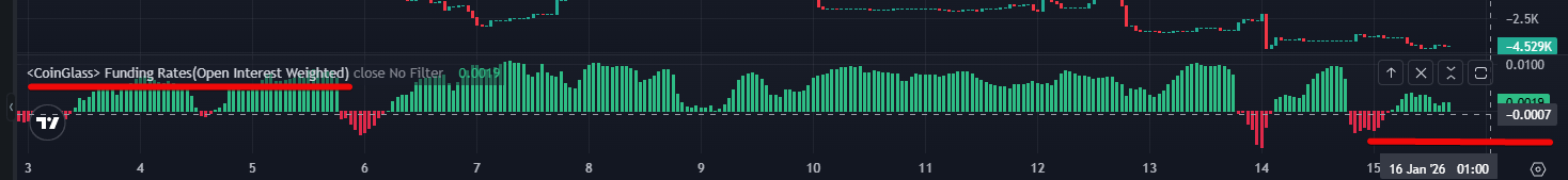
- Negative value (e.g.,
-0.0007%) means shorts pay longs - pessimism prevails. - Positive value (e.g.,
+0.0109%) means longs pay shorts - optimism prevails.
After adding the needed indicators, click the Save button to save them to your account.

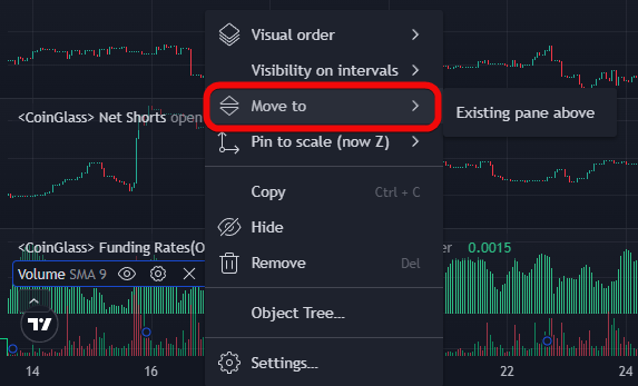
We recommend merging the volumes with the price chart by moving them below the price via settings. This frees up space. To merge indicators, click on the three dots and select Move to.
You can also configure the display of indicators, expanding or shrinking them using Shift and the mouse. Over time you'll get used to the service because CoinGlass is very convenient and many indicators are not available on TradingView.
Legend
The next tool here is called Legend. Essentially, it's an advanced version of supercharts, allowing you to combine unique indicators and data layers in one window.
There's a plus sign at the top and you can add all convenient tools.

Hyperliquid Liquidation Map- convenient because levels are updated in real-time following price movement. Unlike static maps, this indicator automatically removes levels if positions were closed earlier. This allows you to see only relevant liquidity.Footprint- allows you to see clusters when zooming in strongly on the chart, displaying the exact volume of trades that occurred at specific price levels within each candle.Liquidity Heatmap- helps find confirmation for trade entry, visualizing large limit orders in the order book that act as magnets for price or zones of strong support and resistance.Large Trades- used to track already executed market orders of institutional scale (e.g., from $10 million). This helps understand whale activity and their influence on the current price direction.
Options
And for dessert – options. Options are presented here as an important analytical layer, allowing you to assess the expectations of major players and potential price movement boundaries.
Here, the largest Bitcoin (BTC) options positions on exchanges like Deribit, Binance, etc. are shown. 2 main numbers:
- Open Interest (OI) – how many contracts are still open (in BTC).
- Volume (24h) – how many contracts changed hands in the last 24 hours (in BTC).

If you click on Deribit, you can view detailed statistics. One of the most advanced ways to use options data is Gamma analysis.
Gamma shows how quickly an option's profit will change with price movement. Option sellers, to hedge their risks (gamma risk), are forced to make trades in the futures market.

Remember, when the BTC price enters a zone with high gamma, the market often "freezes" in a sideways movement or meets sharp resistance that pushes the price back into the range. This happens due to counter-activity from option sellers trying to balance their positions.
Service Shortcomings and Criticism
We have fully reviewed CoinGlass. It's time to talk about its shortcomings.
Let's look at the shortcomings in the table.
| What can go wrong? | What do you lose? |
| Exchange APIs deliver less than 1 liquidation/sec - data is understated multiple times | Underestimate the strength of price movement |
| Liquidation maps are built on models, not real stops! | Magnet levels may not work |
OI charts cannot be quickly scaled/overlaid on price |
Waste time on manual formatting |
| All metrics show the PAST: liquidations, funding, fear index | Won't know about a black swan |
| Whales see the same liquidation zones and hunt for stops | Blind trading by magnets is a trap |
| OI/funding are adequate only for BTC/ETH | On alts, signals are noisy/false |
| API failure or access ban during volatility | Left without data at entry/exit point |
Moreover, many tools are redundant. For example, Max Pain (maximum pain price for options) is useless for the crypto market due to its insufficient liquidity compared to traditional assets.
Conclusions
And although the main page looks very similar to DropsTab, here there are many unique metrics not available on other free analytical services. Among the most important are:
- Liquidation Maps because they give you X-ray vision of the market, allowing you to see levels where huge volumes of forced position closure orders are concentrated.
- Funding because it is a key indicator of sentiment and market overload with leverage.
- Open Interest because it shows the real inflow or outflow of live money.
Other metrics will most likely not be needed because when there are too many charts, analysis paralysis can occur...
Most exotic indicators are redundant data that often carry no practical value for decision-making and only distract from understanding the fundamental liquidity of the crypto market.
Whether to use CoinGlass or choose another analytical crypto service from the rating is, as always, up to you. Happy trading! Your editor - Maksim Anisimov for bytwork.com.
Disclaimer: All information provided in this article should not be taken as financial advice. The article was created for educational purposes. Never invest more than you can afford to lose, and seek advice only from your personal financial advisor.


